
Hello again everyone, I hope your weekend is going well. As we get ready to begin another week I’ll offer a verse from Psalms chapter 11, verse 1 that I think is fitting for this post; “I trust in the Lord for protection.”. Quite simply, no matter what is going on today, trust God for protection.
With that, I read an eye-opening article on MorningStar today titled, “He broke the Bank of England – now he’s coming for America. How to bet with this trading legend using ETF’s.” Feel free to have a read yourself but what really struck a chord with me was a line that suggested in today’s economy we’ll need 10% returns just to break even. After reading that, I just had to take a closer look.
So, in today’s post, we’re going to consider the U.S. Money Supply, Inflation, & Debt to see if there is any truth to the claim. However, before you jump in I need to state this loudly, I’m not an economist and almost certainly unable to provide reliable information on these topics. Said another way, I’m likely to miss something important so proceed with the understanding you’ll need to verify anything that follows.
Before we move on and as a brief aside, if you’re new to OptionBoxer.com, you may want to head over to my Free Trading Tools page. There you’ll find several completely free resources to assist you on your options trading journey. Now, back to why we’re here.

Post Agenda
U.S. Money Supply – M2 Data
After reading that article linked above I was literally floored by the notion that as investors we’ll need 10% returns just to stay even. Further, the article suggested that each year the money supply has increased by 7.3% per year, compounded. So, it only makes sense to take a look at the M2 money supply chart to verify this claim. The chart below was found at the St. Louis Fed website FRED.
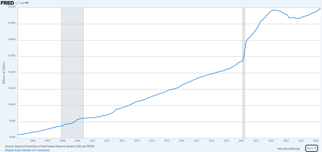
Well, the first obvious sign we’ve thrown caution to the wind, I suppose, started during the covid pandemic. We went from 16 trillion to over 18 trillion in just that year. Then of course we followed that trend in the two years following before reversing course in 2022. Now, we’re back to full speed ahead and the trend seems to mirror the trend that existed before covid.
Regardless, the claim was we’re increasing the money supply by 7.3% per year. Let’s use round figures for the sake of simplicity to see if that is indeed the case. I’ve purposely started the chart at 2005 so that we have, essentially, 20 years of data to consider. I think that’s a long and short enough time period to determine the validity of that 7.3% figure.
So, here’s my math, but please correct me in the comments if you see a mistake.
- Ending Value (2025) = $22 Trillion
- Beginning Value (2005) = $6.5 Trillion
- Number Years (n) = 20 Years
- CAGR = (22/6.5) ^ (1/20) – 1 = .0622 or 6.22% annual money supply growth
Well, not quite the 7.3% but still a higher number than I’d prefer.
I guess that receives a check for valid, let’s take a quick look at inflation as well since that also works to erode our buying power.
U.S. Inflation
After seeing that our treasury department is most likely being run by drunken sailors I wanted to see what percentage of inflation we’ve averaged as well. Similarly to the M2 Supply chart above I’ve maintained as close to the 20 year date parameters as I could. The chart below was found using Consumer Price Index at Macrotrends.net.
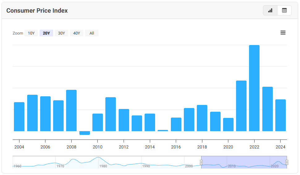
The graph doesn’t provide a scale to determine what each bar represents. To make that clear, here is a list from left to right of each bar.
- 2004 – 2.68%
- 2005 – 3.39%
- 2006 – 3.23%
- 2007 – 2.85%
- 2008 – 3.84%
- 2009 – (0.36%)
- 2010 – 1.64%
- 2011 – 3.16%
- 2012 – 2.07%
- 2013 – 1.46%
- 2014 – 1.62%
- 2015 – 0.12%
- 2016 – 1.26%
- 2017 – 2.13%
- 2018 – 2.44%
- 2019 – 1.81%
- 2020 – 1.23%
- 2021 – 4.70%
- 2022 – 8%
- 2023 – 4.12%
- 2024 – 2.95%
If I add up each year and divide by the 21 years listed I arrive at an average yearly inflation of 2.58%. If we add that to our 6.22% money printing effort we come to 8.8%. Basically meaning, we need to realize almost 9% annually just to combat the erosion of our money by inflation or our own government. Not exactly a comforting thought but let’s continue and have a look at U.S. Debt, that’s sure to paint a better picture.
U.S. Debt
This is where things get a little complicated because the correlation to our investments occurs indirectly. When considering U.S. Money Supply, Inflation, & Debt the first two eat away purchasing power. The later impacts policies and procedures that could alter purchasing power. That said, let’s start with a chart of the U.S. Federal Debt. The chart below was found at the St. Louis Fed website FRED.
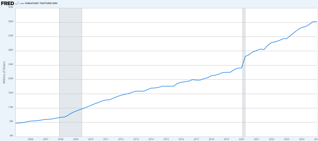
Instead of doing the math here, I Googled what the growth rate was on our debt year over year from 2005 to current. The approximate annual growth rate of the U.S. Debt was 7.98%. Oh good, I was worried this would be bad :(. To say it another way, we’re compounding our debt as a country at almost the same rate per year as the S&P 500.
In any case, let’s put all of this together to understand where it is we actually stand.
U.S. Money Supply, Inflation, & Debt – Putting it all Together
Ok, at this point we’ve had a look at the charts and the message seems clear. We’re fighting an uphill battle as investors. To contend with monetary policy alone we need to earn more than 7% a year. Add in inflation and we’re really pushing that 10% number from the MorningStar article. Add debt and it’s a toss up on how much we’ll need to return.
Debt doesn’t seem to have a direct impact but it may have a larger impact. For instance, the larger the debt the less growth we may experience. Growing debt could also mean raising taxes or the dismantling of government programs. Furthermore, the debt could force policymakers into an expansionary policy which further increases inflation and the money supply.
The real problem is, when looking at U.S. Money Supply, Inflation & Debt all together, it looks like we’re winning. Since purchasing power isn’t visible day to day or even month to month. No, we have to look back later and adjust for these factors to see we’re barely treading water.
In all, it’s a bitter pill to swallow learning that I need to earn more than 10% just to breakeven. Truthfully, it all seems really bad… but we can still take heart… God doesn’t need any of it! If you decide He is your future, the rest of this is really just to pass the time.
Until the next post.
God bless,
Jeff


