
Hello again, I hope you had a terrific Thanksgiving and there was plenty of dessert, or turkey and dressing, if that’s your preference. Personally, I live at the dessert table when my family gets together and the dog gets all the green bean casserole :)! Honestly, even the dog looks at it suspiciously.
In any case, I hope it was a great one and peace was in abundance. At church today I had the opportunity to speak and I can say I don’t think most were expecting the message God had directed me to. I think most were hoping for a message on thankfulness and rightfully so. However, what we discussed was equally important, removing all the high places in your life. I know I am guilty as charged because it’s not easy to not want, stuff. The problem is; how important is that stuff? To much and we’re heading for trouble, at least as I understand it.
Now, I’ll be brief today but I had some time over Thanksgiving so I decided to create a marketview dashboard. Just like it sounds its a tool to help me get a pulse on the market each day. Alternatively, if you’re interested to create something more robust for yourself this video from Hamish Hodder on Youtube may also be helpful. Let’s take a look.
EDIT – I’ve corrected the error that wasn’t allowing access. It should now direct you to make a copy for use. If it does not please leave me a comment or reach me at Jeff@optionboxer.com. God bless!
Post Agenda

MarketView Dashboard Overview
First, this is really just a visually appealing way to view data that is easily obtainable elsewhere. In fact, in my Signature Series Spreadsheets, you’ll find much of the same information generating a simple favorable/unfavorable tag. However, I’ve gotten to a point I would rather see a visual than another snippet of data. Maybe I’m the only one.
Regardless, I had the free time so I put together this dashboard to give me a better feel for which way the wind was blowing each day. Then, I thought I’d share it with anyone else that may want a similar tool. Lastly, before we discuss it specifically, you should know it is very much a work in progress. If you come back later it may function wildly different, or it may become a tool I find less value in. We’ll have to see.
Well, here it is. Maybe I got carried away with the gauge charts but I thought they made the most since given the idea of this spreadsheet. That is, I want to know which way things are moving, and how dramatically there moving there.
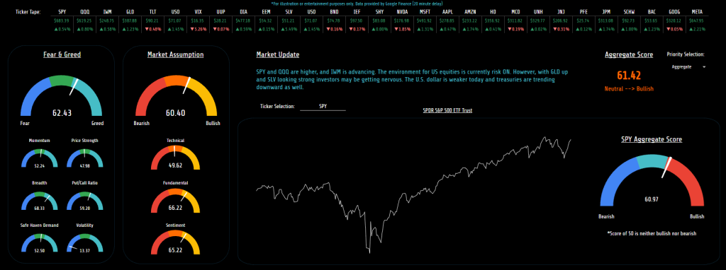
Ticker Tape
To begin, along the top is just a “ticker tape” of sorts that I can enter in whatever symbols I’m wanting to keep an eye on. Probably something already easily available inside your broker but I thought it made sense here also. Additionally, the first few tickers here help to create the “Market Update” section and give me a complete view of what the market is saying any given day.
Fear & Greed Index
To the far left of the page is my own version of the fear and greed index. What’s important to note, both here and elsewhere, is a score of 50 is neutral. The original fear and greed index points all the way higher or lower during fearful or greedy periods. Instead I wanted a more complete view, considering both the near term and the longer term sentiments. So while we may be in a period of heightened volatility today, overall, the market is fairly neutral.
This indicator, in theory, should help me get an idea of when the market is turning over for a sustained period, not just this week. Just below that are the individual criteria that make up the index here. This should help to understand and visualize how I arrived at the overall score. For example, in the image you can see most scores are neutral but volatility is lower, relatively speaking. This pushed the overall score into bullish territory, if volatility rises that will pull the indicator back into neutral or potentially bearish territory.
Market Assumption
Moving along, the next section is my own market directional assumption based on 18 different technical indications, 12 different sentiment tools, and a few fundamental or economical data points. More or less, it’s everything I usually look at individually, all rolled into one score. Again, the preference was more on the bigger picture and a score of 50 would indicate a directionless market, at least according to the data included. Please also know now, I wouldn’t blindly trust any specific tool, its imperative to always lift the hood and have a closer look.
Market Update
This area is more or less an announcement about the market that day. I routinely want to know where the indexes are heading, where commodities are pointing, and what the treasury market is doing. If you want to see other items highlighted here each day, feel free to alter the formulas inside that cell to call attention to any regularly used information.
Price Graph
Just below the update you’ll see a rudimentary price graph. I didn’t want to reinvent the wheel here, I just wanted to provide a quick view of price movements over the past year. Additionally, I didn’t or haven’t yet, included the ability to alter the time frame. More than anything, I just wanted a brief view of what price was doing along side the score chart. Kind of a contextual piece so that the score made more sense.
Aggregate Score
Along the right side of the page you’ll see the combined score from the fear/greed graph and the assumption graph. I’m realizing now that the placement of that score may not be ideal so I might change it at some point. For now, it’s just a combined score and as we stand today, mildly bullish.
Asset Score
Just below you’ll see the score for SPY, in this case. This gauge is solely attached to whatever ticker symbol is entered above the price graph. I used the same tools to analyze this symbol as I did for the market assumption I just arrived at the “score” with a slightly different calculation. As you can see, the score for SPY here is just slightly different.
That said, it’s important to also know, this score is less reliable and really only included for fun. It’s impossible to compare every asset by the same metrics. For example, a PE of 25 may be good for SPY, but less so for NVDA which would lead to scores that aren’t particularly useful. In the future I’m probably going to add the ability to alter this chart based on custom scoring metrics. Time will tell.
MarketView Dashboard Functionality
To be as brief as possible here, the function of the dashboard is just to highlight where the market stands and how things are moving. Nothing pertinent because all the data is routinely available inside most brokerage platforms. However, with the dashboard view, everything is combined and calculated based on an equal weighting. That of course may or may not prove beneficial but it does consider every data point to create the scores. That alone avoids me overlooking something or tuning out a particular piece of relevant information.
More or less, I see the tool as a starting point. For example, if a favorable score appears and I’m ready, now I can dive in for a closer look. If I’m ready to take a trade but the score looks unfavorable, maybe don’t waste the time just yet.
In all, it’s just a picture of what we look at inside or brokerage platform every day. Only packaged together for easier viewing.
Final thoughts
To close, hopefully you (and I) can find some use out of this free tool. I will be tweaking and correcting the spreadsheet as I use it but if you see something it needs, let me know in the comments. Having a score considering all the angles each day at the very least guarantees I have a current market view that considers all the available data.
That however doesn’t mean it will be accurate, most indicators use the rearview to see the road ahead. Sure, it may work for a period but eventually something or someone is going to cut you off and when it happens no amount of hindsight will prepare us.
Until the next post.
God bless,
Jeff


